October 2009
It’s not as if the world is divided into users and non-users. Developers are also users of other applications, and they are as myopic as anyone else when using other people’s programs. (They may be even more impatient, not wanting to break their workflow.)
Once I realized this and caught myself myopically not reading dialogs in other applications, the point suddenly sank in and I became much more aware of this in my own work.
October 2009
what business? This is a free site.
in case the concept of a word having multiple meanings is foreign to you:
“5. (uncountable) One’s dealings; patronage. I shall take my business elsewhere.”
Also, who do you think generates the revenue to keep the site going if not the users?
October 2009
I don’t know if anyone else has mentioned this ( several pages of comments + at work == no time to read them ), but when I look at the question input page, one thing comes to mind.
The area where all those fun, awesome, helpful hints are? Same area that ads are placed in on other sites. Part of “user myopia” may be that after all this time, advertisers have trained people to ignore anything that isn’t content. So when a user sees the text input box, plus some stuff off to the right that is differently coloured, they ignore everything else because it might be an ad. I don’t think this is something that can be fixed, and for more advanced internet users, it may be a bit more of a problem – they’ve been exposed to more ads than your average user, so their blinders are even more severe.
October 2009
I have the perfect solution to deal with this problem:
 _____
/     \
|/~~~\|
||O O||
||   ||
|| J ||
||._.||
 |    |
  \__/
Hi.
It looks like you are trying to type a numbered list.
Would you like help with this feature?
October 2009
“pre-populate the question entry area with some example formatting that is typical of the average question” - Please do! As well, I can’t see any formatting advice when adding a comment when the page is long.
October 2009
I guess this is exactly why Apple is as popular as it is. If you would strip down all but the text input area you would then automatically contrast any clues you would place on the page. I mean i just think that there’s a lot of stuff on the page, things you need, like the title and tags but still.
And so when you have more than one thing which demand your attention, you immediately just try to get through everything quickly, because in the end you’re just trying to accomplish one thing.
October 2009
Jeff is turning into a bitter old man. Soon, he will be screaming at users to stay off his virtual lawn while reading a computer shopper magazine and professing the virtues of a dead age.
October 2009
Hi Jeff,
Thanks for the thought-provoking post. I dare say I am capable of reading and following instructions… but would be very unlikely to look at your helpful formatting guide or use the formatting toolbar. Like many busy users, I tend to focus only on the absolutely necessary parts of of a task or site. Also, as others have pointed out, your guide appears in a place (and is formatted in a way) that is similar to advertising – which I am adept at ignoring.
Don’t blame the user – simplify the interface.
October 2009
heh by not reading last 250 comments I want to reiterate.
I want to notice that yes in your example your markdown screwed completely well formatted text. Your new line issue is for sure PITA.
Last week I asked the first question on SF. And I was also 1second away to post the badly formatted question. And then thought wtf when seen it on preview.
For me it was confusing to introduce additional double carriage returns. And yes i did not see/used any toolbars and your hints.
Why should I? It just filling textbox anyway.
October 2009
So you would like some sort of animated character to appear in the middle of the text box, something like:
“I see you’re trying to enter a piece of code, would you like some assistance?”
Perhaps a dog, wizard, or talking paperclip?
October 2009
Why not abandon the markdown editor and a “rich text” editor instead?
(Dare I say it? WYSIWYG.)
I tend to view markup tags as programmer’s detail. You (as the maker and maintainer of StackOverflow) care about markup, but your users shouldn’t have to. Its not our business.
October 2009
That’s why you should have relied on a rich text editor, as Bill P. pointed in the other comment…
A wikipedia like approach is nice for technical people, geeks, power users, etc., as soon as you reach more “junior” techies you have to simplify your approach.
Screwturn Wiki for example has both worlds: you have the “plain view” where you place markup, and the WYSIWYG view (also supporting copy+paste of basic HTML). My girlfriend uses the rich view, I use the plain one, and both of us are happy 
October 2009
One obvious improvement would be to use single carriage returns as line breaks. The input looks good by that, the preview doesn’t. That’s a bug. (Or maybe not, not knowing what will happen the other way around.)
October 2009
Markdown is WYSIWYG – for ASCII.
Notice that the plain text looks no better in this case.
It’sasifitypedthistoyou.
Itlookswrong.
Becauseitiswrong.
October 2009
I’ll have to join the choir here - I’d use single CRs as a simple way to separate list items:
- do this
- do that
- etc
Only if the items are too long, I may add another CR between the list items.
And in the few times I’ve asked stuff in StackOverflow, I had to fight with the stupid formatting to get it to display the way I want.
October 2009
Your “how the user sees the ask question page” screenshot is wrong, because it includes the preview.
October 2009
Except the plain text does look better. It at least preserves the newlines between items in the list.
October 2009
I believe you have your “here’s how the user sees the ask question page” drastically wrong. You should black in the lower half of your transparent section.
Even accounting for users who have Javascript turned off by default and those who don’t have their browser at full screen height (count me in both categories) it’s still baffling, not unreasonably, to be typing stuff and then find out there’s something showing you how it’s actually going to end up.
WYSIWYG really is the only way. And to be honest I’ve never seen the need for 99% of fancy formatting in forums and comment pages - most of the time it just works against people rather than for them (try the dpreview.com forums for some of the worst I’ve seen, which makes a number of commonly-typed notations ruin the formatting completely).
Better to do away with fancy features and leave people satisfied than throw bells and whistles at it and leave them downright frustrated.
October 2009
Markdown is WYSIWYG – for ASCII.
Except it isn’t, as your example in the main article perfectly illustrates.
October 2009
October 2009
The text that the user entered is well-formatted. Sure, it’s not markdown, but it looks a lot better than the markdown output. Markdown manages to completely miss the numbered list - that’s a markdown problem, not a user myopia problem.
Not that I can think of a better solution, but the problem here is the technology.
October 2009
“It’sasifitypedthistoyou.
Itlookswrong.
Becauseitiswrong.”
Why are you blaming the user for not realising that they’re effectively writing source code rather than a simple message? They’re not wrong. Your invisible compilation stage is the wrong bit.
October 2009
Don’t blame the user.
If you put useful information where other people usually put advertising, don’t expect the user to even glance at it.
I have used stack overflow for some time, and have only recently become aware of markdown. I thought I HAD to use HTML tags to get line breaks.
Better yet, just detect that the user is clearly using plan ascii linebreaks as linebreaks (how obvious is that?), and if so, use line breaks as line breaks!
So this is not a user problem. This is a developer problem. Don’t be a problem developer and blame gthe user.
October 2009
Of course users ignore all the clutter around the edges of the web page. Years of exposure to add-supported commercial websites have trained this useful habit into us.
Fixing “user myopia” by adding more stuff and more highlight around the edges is not the answer. Time is short, attention is precious, and adding more clutter just makes users pay even less attention to all of it.
The only cure that I have found is that after I start to trust a site (e.g. Stackoverflow) I’m willing to come back and pay enough attention to learn its conventions, bells and whistles.
October 2009
Also, for those of you complaining about the WYSIWYG rich editors – note that if this user had clicked the numbered list toolbar button, it would have converted the text to a proper numbered list.
Simply pressing carriage return between paragraphs would have also worked absolute wonders.
Unless you write like this, with no carriage returns between your lines.
Personally I find that a bit odd. But is it normal for some users? This certainly does not look correct to me.
Does it look correct to you? Would you type a bunch of paragraphs with no carriage return between them?
There’s a certain lack of… persistence, and exploration… here. And I’ll remind you it’s perfectly possible to create godawful formatting in Microsoft Word, even with every WYSIWYG tool in the universe at your beck and call.
October 2009
Hey, I entered a long-ish comment, only to get a submission error.
Not only do you misundestand the user, your site appears to be broken on top of that.
October 2009
Don’t blame the user.
I won’t blame you for not noticing that your comment was in fact posted, then 
October 2009
People won’t really read stuff which’s in an area where usually ads are.
October 2009

Your users shouldn’t have to learn a formatting language (with a tiny User Manual in a sidebar) to edit a comment. All this user wanted was for carriage returns to appear wherever he hit the Enter key. Why would that be an unreasonable expectation?
I’m expecting (but I can’t be sure because there’s no preview option) that when I post this comment, the fact that I hit [Enter] after typing “the Enter key.” above will be reflected in the published comment. If it won’t, I’ll be unhappy because I hit [Enter] for a reason.
The primary objective of your comment interface is communication, not good-looking text. Gazillions of plain-text e-mails prove that you can communicate just fine without any formatting. The way it’s set up now, you’re inconveniencing 90% of users who just want to enter raw text to accommodate the 10% who want to make a word bold or indent their numbered lists properly.
And before I click the Post button, let me say that I don’t care one bit which font this comment appears in, so long as people can read it.
October 2009
OK, I’m a reasonably technical user, but if I was posting on this site and my brain already was fully occupied with the particular problem I was posting about, there’s NO WAY I would be able to handle reading and interpreting the ‘formatting reference’ you helpfully have tucked out of the way on the RHS. It’s just a jumble of usage examples that aren’t actually examples because there’s no indication of the end result. It’s messy and completely opaque.
Users expect their posts to look the same as the contents of the box they typed their posts in, and rightly so. If it’s otherwise, in any way, it’s either the fault of (1) the designer of the site, or (2) the user’s browser misbehaving
October 2009
Jeff, there is a saying that goes: if one person tell you that you drink to much you can ignore it, if you hear it again, you should think about it. If 3 people tell you that you need to consult a doctor.
The markup is not intuitive by any means, it is only after you use the site for some time, or you were using similar approach before you begin to get used to it. But still is it not right that what you write is not what you see, especially considering that the user has access to the formatting toolbar -very confusing. It was acceptable for stackoverflow, not so much for superuser, that sites are pretty mature now so blaming the user for not understanding the interface in simply wrong. This interface is simply not user friendly for first time visitors
October 2009
I think the problem in this particular case is that Markdown often ignores single returns. It seems to me that the user is actually trying to use Markdown, but doesn’t realize that his text isn’t formatted properly because he hasn’t put two returns in front of the list, and between paragraphs.
Generally, the post is absolutely correct, though. Users don’t read, and it’s almost never possible to fix usability problems by adding more explanatory text; that just clutters up the page and makes the whole thing even more confusing to users. Putting a simple example right into the text field is certainly worth a try.
October 2009
I guess the big disconnect here is expecting users to put a carriage return between paragraphs; 95% of the original formatting the user wanted would have worked, completely, had he done that one thing. No magic required, really, just basic 'net ascii literacy.
I’ll also note that 95% of the above commenters have also put carriage returns between their paragraphs.
So the unusual thing, then.
Is to write like so.
With no linebreaks between your paragraphs.
What is this, ee cummings poetry?
October 2009
The problem I see is twofold:
-
It does not make sense, from the UI design point of view, that you have one place to write stuff, and one place to see how it turns out. If you read About Face, their example with different windows being different rooms fits this case as well. It does not make any sense. Moreover, these two windows are separate, and distant. I always find myself writing something, scrolling down to see how it looks, scrolling up to get the input textarea again, writing a bit more. This is very annoying. The fact that you have to scroll is most likely the reason why a new user does not format at all. It simply does not see the preview area, because its focus is all on the input area and the submit button.
-
Markdown is not intuitive, and does not map well with a TXT ASCII representation, in particular in terms of newlines.
So you have both a UI design issue and a technical issue.
October 2009
The markup is not intuitive by any means,
And yet, Kristof, you put a carriage return between your paragraphs in the above comment. The one very thing the above user couldn’t seem to figure out, and the single solitary source of all his formatting issues.
October 2009

I think a better title for this post would be, “How Far Should We Lower The Bar?”
Or, to put it another way, how many ignorant/lazy/stupid users do you want on your website? Seriously, how difficult is it to look 100 pixels to the right (formatting help) to prevent yourself from looking like a dumbass? How difficult is it to look 100 pixels lower (preview) to prevent yourself from looking like a dumbass?
And who browses with JavaScript turned off anyway? It’s like buying an ATI 5870 and then playing all your games at minimum resolution and minimum detail. If you have a problem with JavaScript, you have a problem with the Internet, in which case I suggest you GTFO.
“How do we treat user myopia? How do we reach these users?”
By irritating them until they either stop being lazy and learn to read, or get so irritated that they leave us alone. It’s a win-win situation; either you reach those users, or they sod off and waste some other community’s time.
Ignorance/stupidity/laziness should be punished, not be rewarded by lowering the bar to make it easier for people to act like that.
“I have used stack overflow for some time, and have only recently become aware of markdown. I thought I HAD to use HTML tags to get line breaks.”
If you can’t read simple instructions - that appear every time you post a question, and that are one click away on any page - I have to question your competence as a programmer.
October 2009
Atwood: “The root problem is lack of carriage returns between paragraphs, which is sort of a fairly accepted standard for net conversation … just read the 20+ comments above yours. Notice a pattern?”
Obviously, it isn’t standard in the population that happens to use the “superuser” site.
I’ve found that not doing what you are expecting is common.
October 2009
@The_Assimilator: Why should one have to read the instructions in order to post? It should be a skill we learn once, and then use forever. It shouldn’t be something we have to re-learn on every single site we visit.
October 2009
So, a large proportion of the commenters on this site think that you should have a carriage return meaning a line break, and you tell them they are wrong.
On the link you posted above, http://blog.stackoverflow.com/2009/10/markdown-one-year-later/, your article expresses doubt about this “feature” and a large proportion of the posts there also disagree with it (on a quick scan - sorry, didn’t read all 56 comments in detail, a summary of the conclusion you drew from it and why would be useful).
Perhaps you shuold take on board how people actually use your interface, and design it in that way, rather than trying to make them work in a way that YOU think is correct. i.e. design your user interface for your users.
October 2009
So, a large proportion of the commenters on this site think that you should have a carriage return meaning a line break, and you tell them they are wrong.
I don’t disagree, we’re still considering that, but it’s kind of irrelevant for the specific example in the post.
The root problem is lack of carriage returns between paragraphs, which is sort of a fairly accepted standard for net conversation … just read the 20+ comments above yours. Notice a pattern?
Yep, carriage return between paragraphs.
October 2009
Jeff: Some people (me included) separate paragraphs with double-linebreak. Many (most?) don’t, though.
I can’t imagine what world you’ve been living in if you only now noticed it.
Seriously, it’s strange to hear from you complaining about users. Even I, being a geek, prefer being able to do whatever I want, without first reading a “how to” on this. Especially for something as trivial as writing text.
October 2009
When designing a site you have to account for your users’ previous experience. Look at expert-sex-change. Top of page - ads. Whole right column - ads and bullshit. Bottom of page - ads. And almost every other site out there does the same thing.
You can’t just go and start putting useful information in exact same location and expect people to look at it.
October 2009
Sure users don’t read everything on the screen.
Have you ever watched a user who tries to do this - I have!
It takes forever to read everything, and by the time they are done they’ve taken in so much info (often in the “wrong” order) that they are just confused.
Reading virtually nothing works pretty well.
If you think WYSIWYG isn’t the solution I’d suggest plain text input as the default, with markup as an option - hopefully when people switch markup on they would read a couple of lines of text about what it does.
October 2009
Don’t blame the user. While what the user was typing wasn’t the most wonderful formatting in the world, it had line breaks in reasonable places, and the numbered list was actually a list. It wasn’t great (some whitespace between paragraphs would have helped), but it was at least readable. The version in the preview pane was not.
You need to make single carriage returns do what they are supposed to (start a new line), and you’ll eliminate half the problem.
Also, as others have pointed out, you need to block out the preview pane in your ‘what the user sees’ item. The user ONLY sees what he’s typing.
October 2009
Also - are you HTML people really so out of touch with this world? Is there really some alternative universe where pressing [Enter] in a plaintext editor means “Ignore what I just did and continue on the same line, this button was probably a mistake.”?
October 2009
Sure, the CR issue is one for the user but I wonder if they stopped to think that the preview didn’t match the text they had written? Even so, it should at least match the basic ASCII even if the user didn’t hit return a couple of times; surely that’s how a user expects computer to function?
As for the rest of stuff the user didn’t see - perhaps they were typing their post on a small display and weren’t even aware of the formatting options present? While you commented on how the UI designer may see the page, it’s wrong to assume all users view the site on a display large enough (even a window large enough to see the whole page).
October 2009
It’d be interesting to know how many users have this exact problem (using only one line return for a paragraph break). I would expect it to be quite low at present since MS Word (most people’s primary WYSIWYG editor) has taught 2 line breaks = paragraph break.
Of course, the irony is that Word 2007 has changed this to 1 line break = paragraph break, breaking convention for a whole load of users.
In fairness to Jeff, Markdown is probably the best input system there is. It piggybacks fairly entrenched ASCII formatting stylistics and converts them into pretty HTML.
October 2009
I don’t disagree, we’re still considering that, but it’s kind of irrelevant for the specific example in the post.
Well no, not really. The user in the example has not taken advantage of any of the formatting features of markdown. Such a person is expecting that the comment will still display roughly as he has laid it out in ascii. Interpreting CRs as line breaks would go a long way to achieving this - it is a kind of graceful degradation, if you like.
The root problem is lack of carriage returns between paragraphs, which is sort of a fairly accepted standard for net conversation … just read the 20+ comments above yours. Notice a pattern?
Yeah, but we KNOW (after all, this is what we are discussing) so it would be kind of obtuse to actually refuse to do it.
The user in question is (probably) not refusing out of awkwardness, and presumably he is not an isolated example or you would not be writing about him.
October 2009
People won’t really read stuff which’s in an area where usually ads are.
When I see that “How To Ask” box, I always think it’s an ad.
October 2009
I must admit I haven’t seen the “Formatting reference text”. I found out because of:
- the toolbar
- other people seemed to be able have basic formatting
October 2009
User myopia isn’t treatable!
At my last job we’ve tried built a helpful wizard to help users build a search query (sort of thing that gets executed every day and e-mails the results). Internal usability testing showed our wizard text wasn’t being read.
So we set bigger fonts to the help text - nothing.
We set the text in bold - nothing.
We changed the background of the text and added a border - nothing.
We animated the help text to slide-in - nothing.
Users basically thought the flashy text was an ad and ignored it. The more attention we tried to focus on it the less attention it got. Using advertising tricks to grab user attention backfires - which makes perfect sense.
October 2009
I agree with Bill also. The editor should be WYSWYG, with no markup whatsoever.
I’ve been using the FogBugz wiki editor for a while now, and I’ve also been posting a tiny bit on Stackoverflow. For me the FogBugz experience is way better . You should really try it out for a while and see the difference.
Another wiki engine that does that very well in my opinion is PBWorks : very good user experience me thinks.
October 2009
“Why should one have to read the instructions in order to post? It should be a skill we learn once, and then use forever. It shouldn’t be something we have to re-learn on every single site we visit.”
In the ideal world, that would be the case - and believe me I’ve wished for this many times over the years when I’ve posted on a forum, only to find out my post looks like cr*p because that particular forum software has a different standard for brackets or tags!
But until there is a universal internet standard for freeform text input (i.e. never), different sites are going to implement said input differently. This is where I like SO’s approach, because Markdown is so simple: four spaces or backtick for code, right angle bracket for quote, double angle brackets for a link… a goldfish could remember that ;). And 99% of the time, do you need anything more?
Although I will agree that making links with Markdown is a pain, particularly if you’re trying to add a link in a comment, where the angle brackets seem to be ignored.
October 2009
Nevermind the semantics; the problem is that you’re thinking like a goddam programmer and you what you end up saying is pretty much “that’s not according to spec!”.
You imply between the lines that you really do want to help the user to make his posts look good, except your premise and conclusions are wrong.
Most of your users also seem to be programmers, so mentally they’re treating your textarea as emacs/vim/etc and yell at you when their post isn’t formatted as they entered it (and “normal” users will do just the same). And you respond with what probably every other programmer on the planet would’ve responded: “Your syntax is all wrong! Read the fscking sidebar!”.
See the problem there?
October 2009
“But users will only read the absolute minimum amount of text on the screen necessary to complete their task. I can’t quite explain it, but this kind of user myopia is epidemic. It’s the same problem, everywhere I turn.”
You say that as if your users were the problem.
If you’ll ever have look in any good usability book you’ll find one of the most important axioms: “treat that user as if he is competent but extremely busy”.
Sales guys love to hear themselves talk, software developers love to read everything they’ve put on their user interfaces. Regular guys loathe both.
October 2009
@Goran: you’ve hit the nail on the head - positive reinforcement rarely seems to work, but negative reinforcement does.
As an example, one of our company’s clients does telemarketing (yeah I know… blech) and the telemarketers were constantly ignoring warnings from our program, and hence capturing bad data.
So (with the permission of the client) we setup a training session, in which we made it quite clear that if the users f*cked up the data capture because they ignored what the app was telling them, then they would be penalised - monetarily.
The quality of the captured data improved dramatically after that; we do still get bad data, but nowadays it’s generally due to genuine user error as opposed to user ignorance.
October 2009
Jeff:
I’ve had the same issue when posting, I type out posts like would when I create a plain text email or readme file in notepad. So I’m disappointed when the formatting is not preserved. I then have to go back and figure out how to format my plain text for Stack Overflow. This seems like a silly step.
If you want to see a WYSIWYG example that doesn’t require this extra step, go to Blogger and copy and paste that same message in the default “Compose” view. For people that want full control of the HTML, you can click on the “Edit HTML” tab which allows you to change HTML.
My advice would be to implement a technology that doesn’t get in the way of the user performing his task. Asking users to format readable plaintext adds no value and is a roadblock.
Josh.
October 2009
The default for behavior offline is to use the product and only refer to the manual when you get into trouble. Remember that old saw about the first instruction in a test or manual being “read this document completely before going on to the next step?”
This behavior occurs even when using products that could potentially maim or kill you, like power tools and automobiles. (Be honest, who’s ever read their car manual cover to cover?) Why would we expect anything different from a user when it comes to software?
October 2009
Either make the editor WYSIWYG or just plain text, that markup stuff is just dumb. Also, there’s a real problem in that text too, not just that you don’t like the formatting: see where he (she?) is talking about the path? Now look at it in the preview - it’s “broken” there.
October 2009

Jeff writes:
“I’ll also note that 95% of the above commenters have also put carriage returns between their paragraphs. :)”
While this is true, it doesn’t solve the problem. Many of the e-mails I get don’t use two returns between paragraphs, so I’m guessing there’s a number of people who don’t write that way, even though most of the people commenting here do. Pointing out that 95% of the people don’t have that problem doesn’t solve the problem.
Those wo do have the problem have no obvious way of figuring out why Markdown isn’t working for them. The best solution would be to fix the problem, rather than trying to fix the people.
One way of fixing it would be to automatically add a second return character via JavaScript when appropriate, while the user is typing. Another way to fix it would be to change Markdown itself. Markdown ignores single returns because that allows people to format ASCII text columns with fixed widths without breaking the resulting HTML. I think in Stack Overflow’s case, that feature is not necessary.
October 2009
Jeff,
I believe the problem is you’re trying to make users play your rules, do something in an usual way.
Even if I can understand your point, I’d face the same problem, as the user you showed. For years I’ve been using the ‘Enter’ key to make a line-break in various text-editors.
And if everything I want, is just ask a question, I don’t want to learn a new way to make line-breaks.
So, I think you should accommodate yourself to users, not vice-versa, to ensure they’re happy and you have less head-aches.
Good luck
October 2009
Users do that because we’re trained by advertising to ignore everything that isn’t dead-center. Anything on the side obviously isn’t important, especially if it’s trying to catch your attention.
October 2009
“Either make the editor WYSIWYG or just plain text”
They’re not mutually exclusive…
October 2009
I think it’s very arrogant to speak about users in this way. We are all overwhelmed with a vast incoming information wave every day, every hour, every minute. That the brain tries to canalize this wave into manageable streams is only logical and also very much supported by science. You should stop insulting users and start reading neuroscience text books.
October 2009
(Btw, what that means is that the more sophisticated the user, the less likely they are to be scouring your web page for hidden gems.)
October 2009

You need to target people specifically rather than generally. This isn’t really something that’s unique to UI’s, there’s examples of this in practice in every single human endeavour you want to think of.
Directors know that actors never listen to instructions. It’s irritating and it pisses a lot of directors off, but at the end of the day - when it happens again and again for every single actor they work with - they begin to understand that it’s not that actors are lazy or stupid, but rather that there’s actually a fundamental human principle at work.
One of the easiest ways around it is to target people specifically and personally rather than generically. If you’re sitting in a crowded office and the phone rings, saying ‘Will someone please get that?’ woun’t be as effective as saying ‘John, will you please get that?’ Same when working in a cafe or anywhere with a lot of small, fast jobs that could be done by any number of people. It’s useless shouting a list of jobs that need doing to the room in general, cafe owners will target specific people for specific jobs.
You need to recognise what the information is that you want to convey, who the best person is to make use of that information and put it in front of them clearly, bluntly and with their name prominently attached to the beginning of it so they realise it’s important to them personally.
October 2009
You can’t outsmart stupid people. If you put sample text in the text entry box, you’re going to get a lot of posts where the sample text is included, either as well as or instead of the actual question.
October 2009

What everyone else said. It’s not that your users are myopic, it’s that they’re a little too quick to recognise banner ads, sneaky little Google ads, meaningless copyright footers, and so on. Sidebars on the left are menu items, sidebars on the right are ads. That’s what years of web usage does to your brain.
As for Markdown, what is this, 1990? Computers are supposed to be smart. In 99% of all cases, a half-clever parser would be able to recognise exactly what formatting the user had in mind, then format the message accordingly. You can recognise lists, paragraphs, VARIOUS c-o-m-m-o-n forms of EMPHASISING words, code, spacing-sensitive tables, and so on. To avoid annoying the remaining 1% there is nothing wrong with bringing up the formatted message after the user clicks submit, saying, “This is what your message will look like. Submit it like this? Edit it some more? Stop autoformatting? Need help?”
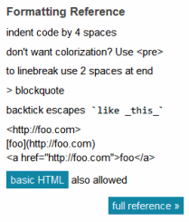
And honestly, the help provided in that sidebar is just cryptic. “indent code by 4 spaces” - Huh? So if I paste in some code, the tab stops are 4 spaces apart? Where do I change that setting? “use to linebreak use 2 spaces at end > blockquote” - so each line should end in " "? And I end the message with “> blockquote”? I am being deliberately obtuse, but I think in this particular case reading the help text wouldn’t help most users at all.
You’re right that users will only ever read the bare minimum of the text on screen. But I don’t like the solution of simply moving text to where the user can’t miss it. You’re much better off making the text unnecessary.
October 2009
The preview pane would be better on the right of the editable pane.
My SO questions normally get quite long and it’s pretty tedious to have to scroll up and down all the time.
Especially now that almost everyone uses a widescreen display.
Oh and my views on the whole CR thing. A double CR should mean “create a new paragraph”. A single CR should mean “put this on the line below in the same paragraph”.
Nice post.
October 2009
Why users read only the bare minimum necessary to get the job done?
Because web sites are 90% fluff. Links you don’t need, advertising of the next coolest browser game, links you don’t need ATM, legal mush.
Documentation is even worse. You want to look something up, you have to skim dozens, perhaps hundreds of pages completely irrelevant to your problem.
Windows dialogs? Have you ever gathered helpful information from a Windows dialog that wasn’t already obvious from the fact that it appeared at all? Yet still the average dialog box contains three lines of completely irrelevant and confusing bla-bla.
So users got used to not-reading, because they wouldn’t get anything done otherwise.
Coming from the Amiga community originally, I weep for what we’ve lost.
October 2009

Of cours users do not read help and do not use tag based formatting (lambda users at least).
While using a form like you describe, you’re advised to format your posting, not constrained to. Even if the user is smart and read the right column text, it could be in a urge or simply do not want to make the effort to format his text, like in “Content only matters”, that sort of crap.
Here we solve this problem of user’s blindness by using separate form fields (wether the are WYSIWYG or not). For this particular example, we would have put somehing like thie
1 title of the question
2 brief description
3 steps to reproduce
4 code sample
5 remarks/comments
I saw few bug trackers using a form design like this, to enforce user to structurate is content.
Even WYSIWYG editors are not adapted to any public, especially when the feed public corporate website. Some users tend to use hugly colors, 16px typo, etc. And in the end, our customer complains that is corporate image is stained by non uniform text layouts and color…
For some projects we drop almost all functionnality in the WYSIWYG editors leaving only a CSS class selector with 3 or 4 classes (say 1 normal,1 colored+bold, 1 for titles, and 1 italic)…
Carriage returns are handled properly using automatic paragraph and HTMLPurifier configured to remove empty paragraphs.
That’s sad for end-users but the only way to get proper output. But they seems comfortable with this, and do fear of final online result, and do not hesitate to use the few styles available to enrich their writing.
October 2009
If a user doesn’t put carriage returns between paragraphs, why punish him by munging his post even more?
What’s the benefit of ignoring single carriage returns?
Question-askers like the one in your post just want an answer - they shouldn’t have to learn arcane rules about formatting - no matter how easy you make it to learn them.
The guy seems to have asked an intelligent wellformed question. It wouldn’t be difficult to format it nicely for him, automatically.
Just interpret the linefeeds literally. You could even detect the list.
October 2009
just read the 20+ comments above yours. Notice a pattern?
yes, pretty much everyone is using:
- double newline for paragraphs
- single newline for bullet points or numbered lists
Conclusion: bullet points and numbered list entries are not paragraphs.
October 2009
I think people forget that a lot of people actually don’t care too much about formatting or presentation. If I posted something which looked wrong I would immediately edit it and figure out how to make it look good.
Unfortunately in my experience a lot of people either can’t see that it looks wrong or don’t think its important to spend time cleaning it up.
October 2009
I’m not a fan of WYSIWYG editing, at least for Stack Overflow. But line breaks with carriage returns are essential, I don’t understand why they shouldn’t be implemented (and I don’t understand Jeff’s comments about this).
Line breaks alone would make the text of the example more readable. I think this is sufficient for the users that don’t really care about formatting. The users that care will go the extra mile.
October 2009
The problem would be solved with (from John Gruber) the GitHub Flavored Markdown (GFM) - http://github.github.com/github-flavored-markdown/
- Newlines: “GFM treats newlines in paragraph-like content as real line breaks, which is probably what you intended.”
- Multiple underscores in words: “It is not reasonable to italicize just part of a word, especially when you’re dealing with code and names often appear with multiple underscores. Therefore, GFM ignores multiple underscores in words.”
- URL autolinking: “GFM will autolink standard URLs, so if you want to link to a URL (instead of setting link text), you can simply enter the URL and it will be turned into a link to that URL.”
October 2009

Why do most people put a line break between paragraphs here? Because they are preserved.
I didn’t used to, but I saw other people doing it, thought it was clearer so started doing it.
I could work that out because I know how line breaks work. I press enter, I get a line break. I press it twice, I get a line break between my paragraphs. I can figure it out because it works how I expect.
Without preserving the line breaks it’s a little more difficult to figure this out. “Why aren’t my line breaks appearing, everyone else has them, but mine get squished. Must be a bug or something. Maybe some complicated markup, or perhaps?” vs. “Oh, everyone else has two linebreaks, I’ll do two as well”.
Because it doesn’t work how the user expects, they find it difficult to work out how to get it to work.
Give in, preserve line breaks. The initial text will then be easier to read, and people can still come in later and fix it with two line breaks. It also makes it easier for people to work out how to fit the community style by logical steps. If one line break doesn’t work, why the hell would two? It’s not a logical step.
October 2009
Jeff,
I think you’ve misunderstood your own post. The point of “Teaching Users to Read” is not to teach users to read, but that you should design UI so they don’t have to.
“My intent is not to make fun of users, but to illustrate that there are far more effective ways to communicate with your dog. Essentially, any time you’re asking the user to make a choice they don’t care about, you have failed the user.”
If a user fails to use your UI in the way you expected, the user isn’t at fault, you are.
Looking at your screenshot it’s obvious why someone isn’t going to read the instructions: they’re in the wrong place, there not highlighted in any way, the title’s misleading. There’s nothing to suggest these are important instructions that must be read before. Until you put arrows around the offending text I would have assumed it was another advert.
October 2009
Also, when will you give up stripping HTML tags and escape them instead?
Maybe some complicated markup, or perhaps?
is meant to read
Maybe some complicated markup, ‘p’ or perhaps ‘br’?
October 2009
People won’t really read stuff which’s in an area where usually ads are.
+1
October 2009
When I press the enter or return key, I expect to get a new line (next character will be on the line below) and a carriage return (next character will be at the left most position on the new line).
So why, when return is pressed in the stack overflow editor does neither of these happen! The next visible character appears immediately after the last one. I wasted my time pressing ‘return’.
I don’t understand at all what the fancy formatter does (except for messing up what I wanted to enter and jumbling it up). I’d prefer it if what I typed in (in the top half of your screen-shot) is exactly how the text will end up when I hit submit. Why have any magic transform at all?
October 2009
Why should I have to learn your special language to post to your sites?
sigh I wish everyone were consistent. Wiki, html, bbcode, yeesh. So much for an intuitive interface.
Remove the “code view” and put it right into preview mode like Blogger or WordPress does. Let the user switch to a code view if they want to format special or type it. See ASP.NET forums for an example of this.
Also, as many have already said, I often ignore things on the right side, that’s where most sites put ads.
October 2009
Jeff, you’re trying to make users do extra work (those additional carriage returns) to accommodate programming choices you’ve made (this whole formatting mechanism).
Yes, many people here are smart and WILLING to learn and go extra length, but if anything, comments to this post should indicate that it’s not the user who you should be working on, it’s technology.
October 2009
I’m definitely a fan of the simple StackOverflow style formatting, but is there any good reason why that post couldn’t have been formatted as the user expected it?
I’m struggling to think of any reason why line breaks in the edit box shouldnt be interpreted as line breaks in the resulting output.
October 2009
I’m afraid that the interface is a very pullable handle on a push only door with the word “push” written on the ceiling. It’s not the user’s fault.
October 2009
Also, in what universe is
considered a “handy formatting quick reference”?
October 2009
+1 for a to be a line break signal to the editor. I wish I could vote more than once.
October 2009
October 2009
This is ridiculous. You can’t expect someone to learn your ad hoc programming language in order to ask a question about software and technology. They aren’t technically savvy and will not grasp the concept of software in many instances… that is exactly why they are asking the question!
Who puts two spaces after a line-break?
It is unnatural. Not even this comments page does it.
What you need to do is adapt to the habituated writing style(s) of the questioners.
Add icons for indent and outdent to the toolbar and support them through the use of TAB and SHIFT+TAB. Every time they type a space at the beginning of the line, don’t ignore it, but treat it as a TAB. Allow all TABs to be deleted regardless of how they originated. All code must be indented. All indented code gets colorised. Turn all text that resembles a url into a clickable hyperlink. Support no other HTML.
Most importantly of all: convert the questioners key-presses into a live preview and only show that.
October 2009
Well, while reading this blog post, i didn’t notice the tips until the second screenshot, with the red arrows.
Maybe because it looks (to my periphery vision) like some kind of navigation/tag cloud? It’s an formatted blob of tips also.
BTW, the 1. 2. 3. lines in the user post seem to be on a new line in the edit box.
Maybe you could put before the edit box something like this:
How to write with bold, syntax highlight, titles
October 2009
yeah thats all there is to the problem. its not a XP or GUI design problem:
- correct carriage returns are hard
- correct spaces are hard
… for users who don’t typewrite much. teach them that and you are 80% at readable ascii. markdown is too hard, forget about that.
October 2009
“To linebreak use 2 spaces at end”.
I rest the user’s case.
October 2009
So this is my first sentence.
I just put a single return here and I want this line to be below the first line.
Now I just pressed return twice and I want there to be a single empty line between the two blocks of text I have written.
Did this work? If not, then it’s not my problem. I expect the output to look the same as in this text box. If it doesn’t, there is nothing I can do about it. This is a developer problem.
October 2009
There are a few things that have lead to user myopia: text ads, wordy messages, technical messages, modal popups (especially for warnings), UIs so bad they couldn’t be figured out even after reading, messages that point out problems and don’t offer solutions, solutions that are too difficult, and the ability of someone else to fix the problem. Among other things.
October 2009
The user in your example figured that the way he typed was how it would show up. Not really an unreasonable expectation.
The user is never wrong.
October 2009
Alright, so my post above worked correctly. And if I were to create a list like the user in the example wanted to do:
- Do my homework
- Take out the garbage
- Write this comment
If the input box on SuperUser or StackOverflow doesn’t work like this then this is 100% a developer problem. nl2br() please.
October 2009
You could just replace single newlines with doubles when not followed by another markdown token. If that is the most common user error, there is no shame in hard-coding some logic to handle it into your form processing. So long as it shows up in the live preview, so those users who do pay attention can see what it is doing, it could save your legion of editors some time 
October 2009
It dawned on me that the genius of Apple is that they provide simple interfaces, and also make the user feel smart for figuring them out.
October 2009

Hitting the carriage return key on a keyboard should give the user a new line in the output. This is simply typographical common sense. What probably confused this user (or he chose to ignore) was the fact that doesn’t happen with this markup.
A markup should not break elementary common sense rules in order to provide other elevated functionality.
The fact users use two carriage returns to create paragraphs in other places (like in this box) is irrelevant. The markup internal rules have stipulated that his text formatting broke because the lack of two carriage returns. That’s fair enough. But his text would also have become easier to read if instead of a new paragraph, every carriage return introduced a line break on the resulting text. And that you cannot deny either, Jeff.
Take a look at the user edit box. Is there anything in there that is not clear in terms of formatting? He doesn’t use carriage returns and yet his line-break formatting style makes that particular text easy to read and appealing to the eye. The markup however made a mess of it. So, the markup actively ruined the user text. This cannot be.
For the sake of some special formatting elements, like list detection the markup aggressively demands two carriage returns to break a line. Meanwhile it doesn’t accept the idea of a new-line break, unless the user explicitly forces it with the tag.
The line that divides easy-of-use and formatting tyranny can be very thin.