I question whether a web browser really has as much functionality as Word, Excel or Powerpoint. Perhaps you might need a few plugins to do something extra (del.icio.us functionality for example, or the pagerank and shared bookmarking in the Google toolbar).
But let’s say you had some outrageous need for this many plugins. You certainly don’t need them all active at at once. There should be some kind of context-driven activation depending on what you’re doing at the time, and the display should be ambient and in-line with the regular content you’re viewing..
Actually you do see pop-up menus on web sites. Msnbc.com is one example, and it’s very telling that directly under the menus is a button to disable them.
Then I guess you’ll have to remove the “Recent Entries”, “Archives”, etc. items from the side of your blog. They are menus. Perhaps not in the same sense as some of the flash-based horrors out there, but menus nonetheless. Perhaps that is what you intended when you said menus?
Having said that, I agree with the premise of the post - the time for multi-level menus is past us. I know I have troubles navigating two or three levels of menus (and the Web based multi-level menus are the worst). I think you are also right in thinking that context is the way to go – just as with Web pages/sites, you can usually define some context that the client is in, and provide some commands that are useful at that level. Word (and related editors) are problematic, though. When you start a Word document, what’s a good context? Text entry? Formatting? Ribbons provide one layer of context, but I’m not yet convinced they’re the right solution, or just another menu. (Guess I need to try Word 2007 to be sure)
For anyone who has had as much trouble figuring out why the Ribbon is so different, here is a movie of the new Office UI:
I dislike user interface elements that change when I go to different sections. The “Contextual Tabs” would drive me nuts. (I already hate that Visual studio wants to pop up the Debug toolbar (and change all of the layout) when I debug something. It feels too much like I am fighting against the application.
The ribbon seems like it will be useful, but I tend to use the keyboard for everything anyway. (I’ll be terribly disappointed if they take away my ability to do things like Alt-i-o to insert an object using the underlined letters in the menu.)
Hopefully with the new WPF stuff we’ll be able to make more web-like desktop UIs - right now everything’s menus and toolbars because it’s excruciatingly painful to do anything else.
I’m now starting to question whether traditional menus and toolbars are even appropriate for small
applications any more. Web applications tend to be small by design-- and you never see drop-down menus
or tiny 16x16 draggable toolbar icons. And they’re better without these things.
Perhaps not for small applications, but how do you do Photoshop without toolbars and menus? Have you ever seen a web app that can do what Photoshop does? I guess I’m not following you because, while I agree that most web apps are hindered more than helped by dropdown menus, they are also generally fairly simple compared to full featured desktop apps.
I’m also not following what you’re saying with your example of the Firefox screen shot. Yes, you can certainly turn Firefox into a hideous monster by turning on everything so that you have one big blob of a UI, but that’s not how most normal people use it. I have what I need 95% of the time on the couple of toolbars that I leave on. Why would anybody do what you did with Firefox and expect that it would be usable.
I predict that CRTs and LCD screens are going the way of the dinosaur, and people will use audible users interfaces. To prove my point, I’m going to blindfold this user…
After reading “Don’t make me think” which preaches the usability of tabs, it’s understandable why Office 2007 uses ribbon, which is a tabbed interface.
Also if you look at sites like Amazon, you can see they use a tabbed interface.
Perhaps desktop applications and websites can have a similar interface…
I don’t really see the Menu or Icons as the problems, but more the fact that you give users the possibility to customize the layout. If people can f*ck up the user-interface, 90% will do so. That is why I really admire the stuff Apple does, that have the guts to say NO to the user.
And somehow they are still admired by the geeks. It is the simple and minimalist design that is difficult to make. Putting all the extra features like extensions and add-ins are peace of cake, they only take the time they take to create.
If my application does not work, I just need an extra mouse button?
Of cause it is fun to pimp your applications, but ask yourself the question, does it really make them better?
I think the office12 layout is a step in the right direction, but only a step. And I do hope that it is fully operational without a mouse.
As already pointed out, MS has spotted this as well and Office 2007 really goes a long way to fixing the usability issues with traditional menus and toolbars.
Until recently I could see a compelling reason for changing over to Office 2007, but then I saw a demo! The new navigation functionality alone is worth the upgrade, never mind all those other smart changes that make you gasp ;-).
They are surprisingly unobtrusive. Considering you tend to end up doing most of the text based stuff (changing font, font size and font styles) through either keyboard shortcuts or the new “floaty” (a small toolbar that appears hovered unobtrusively near selected text) there is most of the time no need to ever switch out of a context tab. And unlike VS “debug” mode, the layout is not all completely changed, new bars don’t pop-up to shift the layout of everything, including the main edit window. Just a new tab slides and fades into view. And then only when you’re dealing with non-text. Which, apart from tables, is not very often at all. It also doesn’t force a switch. When you add, say, a table, it will logically switch to the new table format tab. But if you are in the write tab, or even any of the other tabs, and you select the table, it won’t switch to the new context tab for you. The new tab will appear, but it won’t automatically select it for you.
I’ve been using the UI for a few days now and it’s very impressive. Everything is at your fingertips. You hear people talk about it only taking 1 or 2 hours to get used to it. I was at home within a minute or so. But then I had watched the Channel9 video’s on it.
And I do hope that it is fully operational without a mouse.
Press Alt and text labels will appear over everything. Type the letter(s) that appear in that text label and it will select that tab/drop-down selection/option. Similar to the old system, except it’s changed very slightly to work with the ribbon interface. The fact that it uses text overlays means that it can be used on all UI elements, and is more obvious than an underlined letter. So you can use keyboard navigation for any sort of button etc. that doesn’t even have a text label.
I watched the Office ribbons demo and I think its mostly just eye candy. Well done eye candy, I’ll admit, but I don’t think it really makes Word or Excel more useful. Its like they are putting all their effort into making Office easier to use to generate flashy documents, but not necessarily better documents.
Having 30 pre-defined table formats that magically preview as you hover over them may be cool, but it doesn’t help me write any better. The two things that I’ve always found very useful in word processors are a spell checker and a thesaurus. Those are useful no matter what you are writing: a report, email, blog comments, a thesis. But true-color column headers with animated borders don’t solve a real problem.
Most of my writing today tends to be in email, or browsers: make Word lightweight enough that it can hook an HTML text area and provide spell checking and other writing features and I’d be happy (forget about the grammar feature, though, its barely “gooder” than my own poor grammar).
The problem with Office isn’t a complex toolbar and confusing menu structure - its a set of applications that have grown too complex. The toolbar issue is simply a symptom of a different problem. The new ribbon is just a bandaid, not a cure.
No UI scales when your I is so complex that the app can no longer be U friendly.
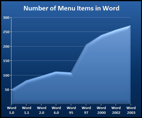
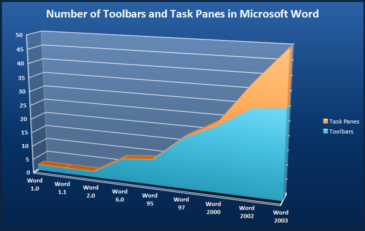
Sure, the Firefox scenario is contrived, because bolting on that much extra functionality to a browser is kinda ridiculous. But the Office 2003 scenario isn’t contrived in the slightest. The rising tide of built-in complexity completely overwhelmed the ability of traditional toolbars and menus to keep up:
See Jensen’s graphs and data points on this. Clearly menus and toolbars don’t scale. But I propose that they scale poorly down BOTH edges of the axis: for complex apps AND for simple (web-style) apps.
changed, new bars don’t pop-up to shift the layout of everything, including the main edit window
I’m glad you brought that up, because that drives me nuts! I hate it when I’m tabbing (or arrow-clicking) through visual studio sub-windows and the view’s shifting all over the place as toolbars appear and disappear.